Case Competition - Gies Sustabinability Dashboard

Overview
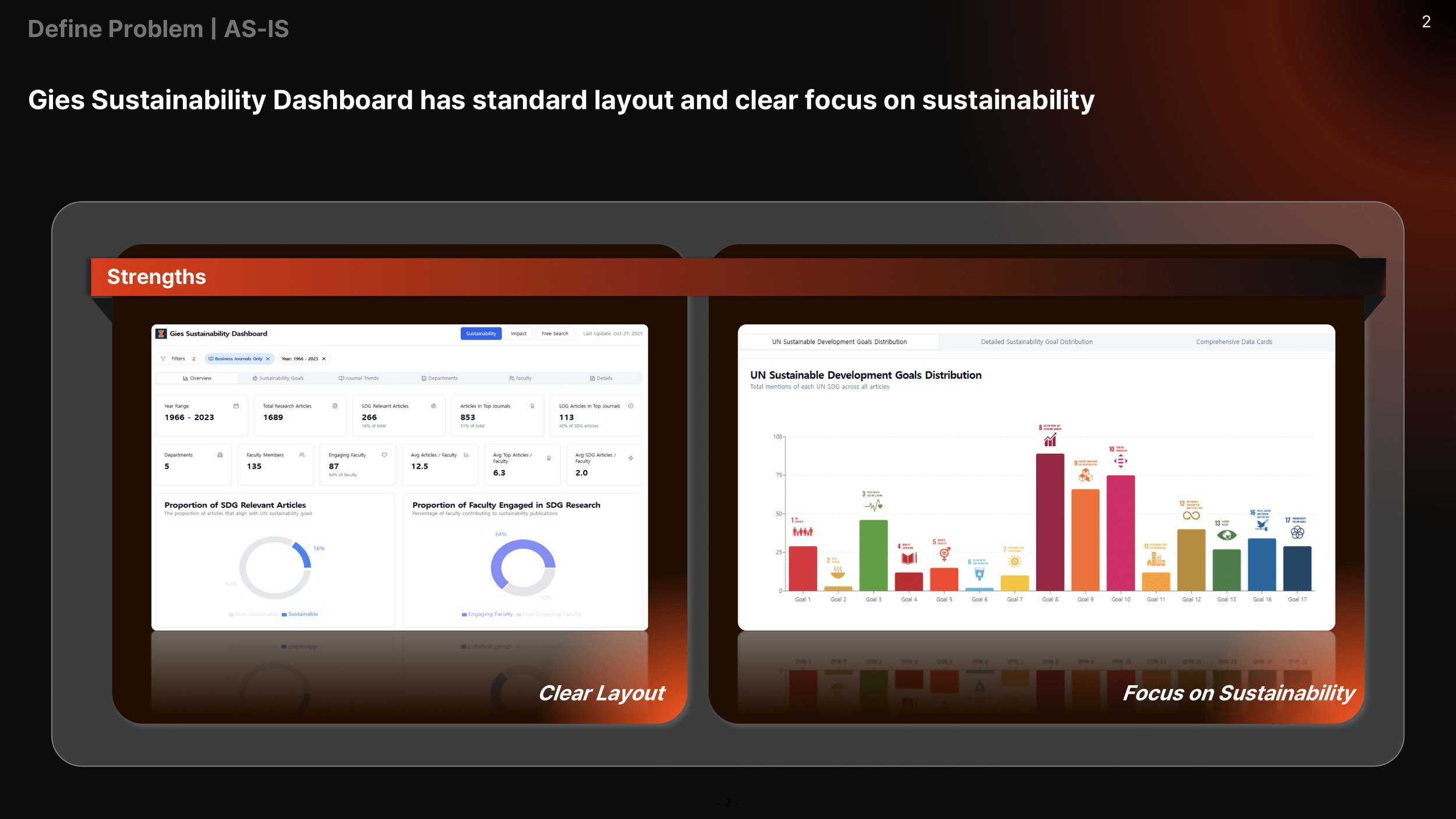
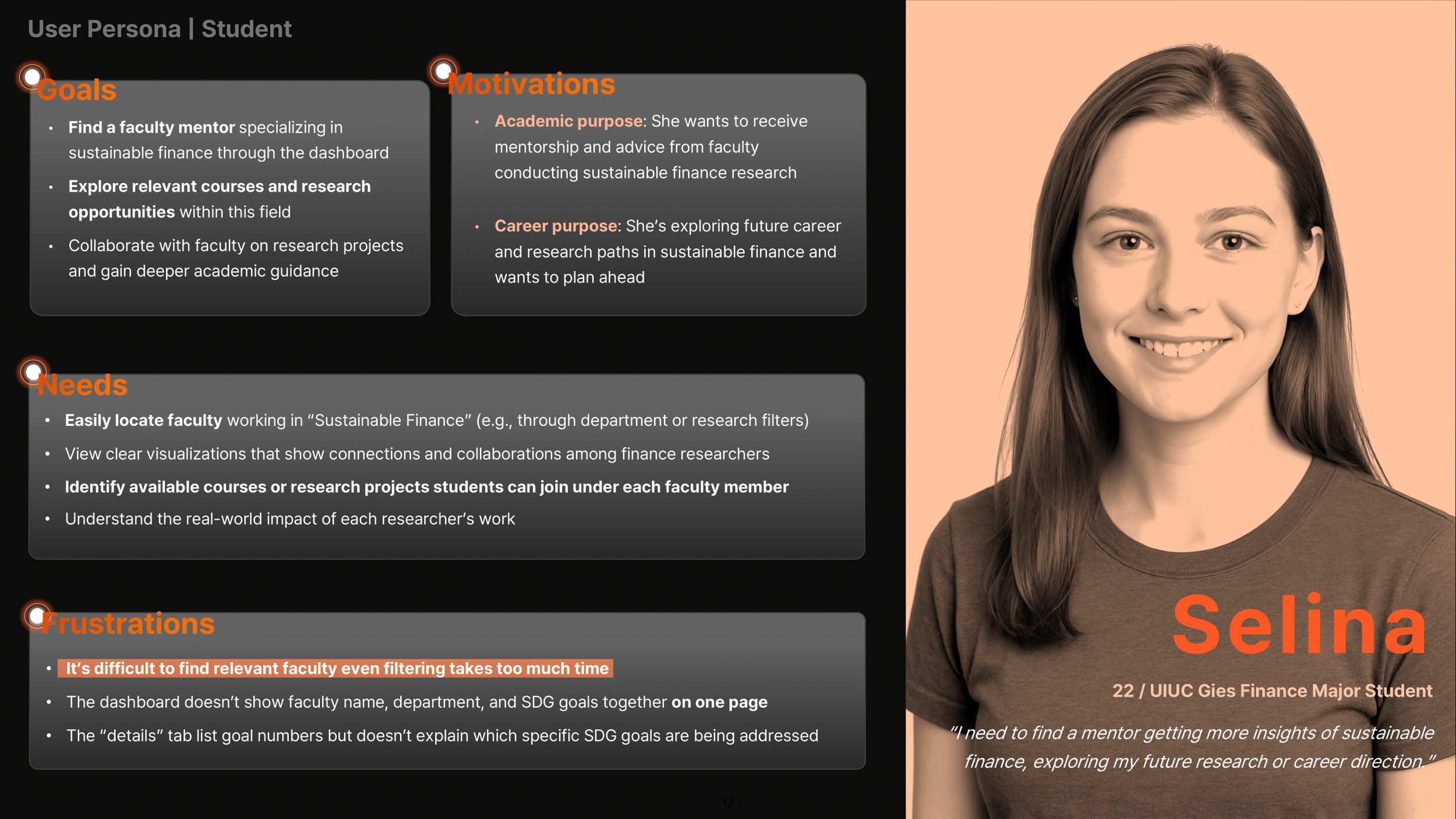
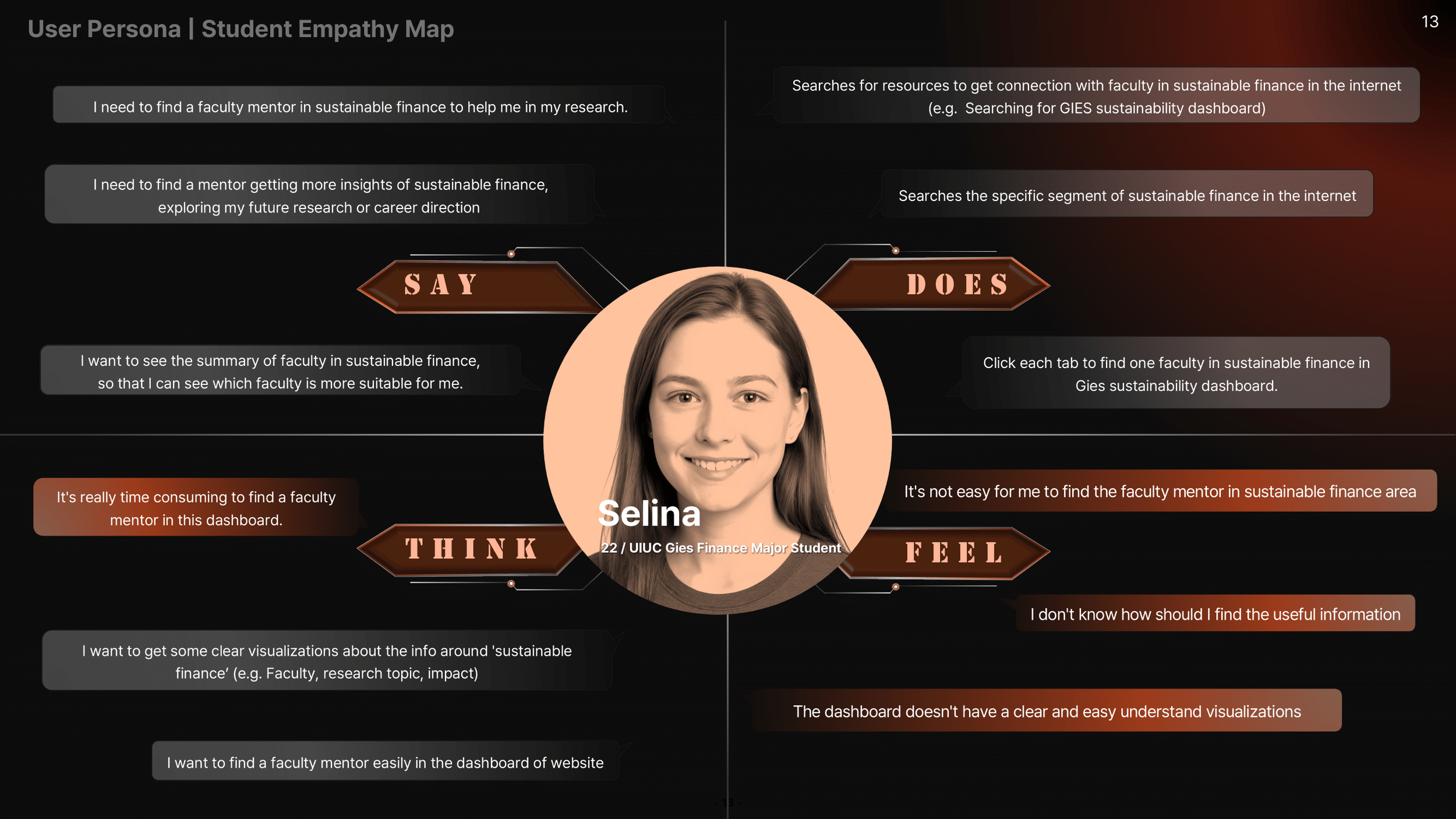
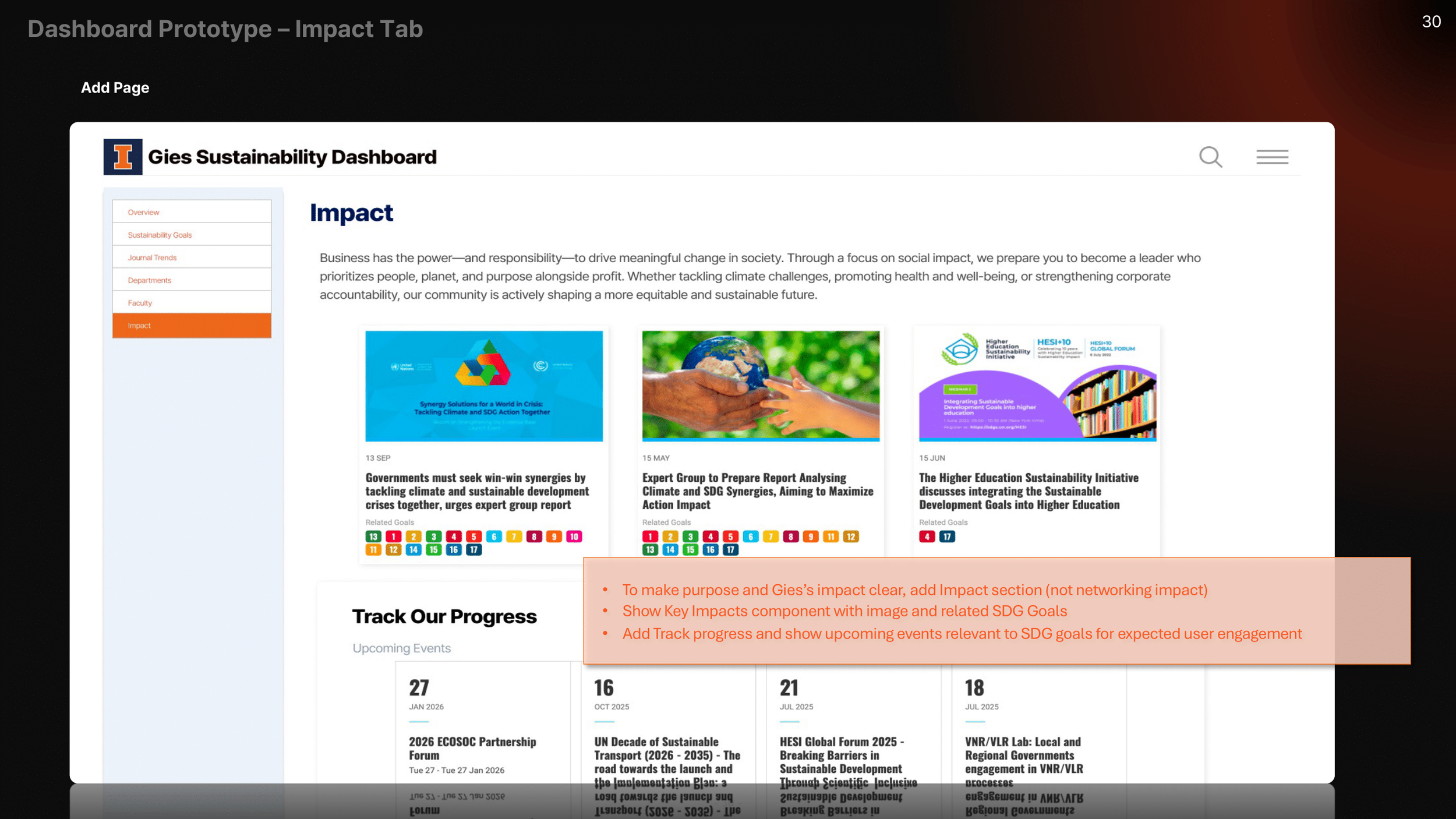
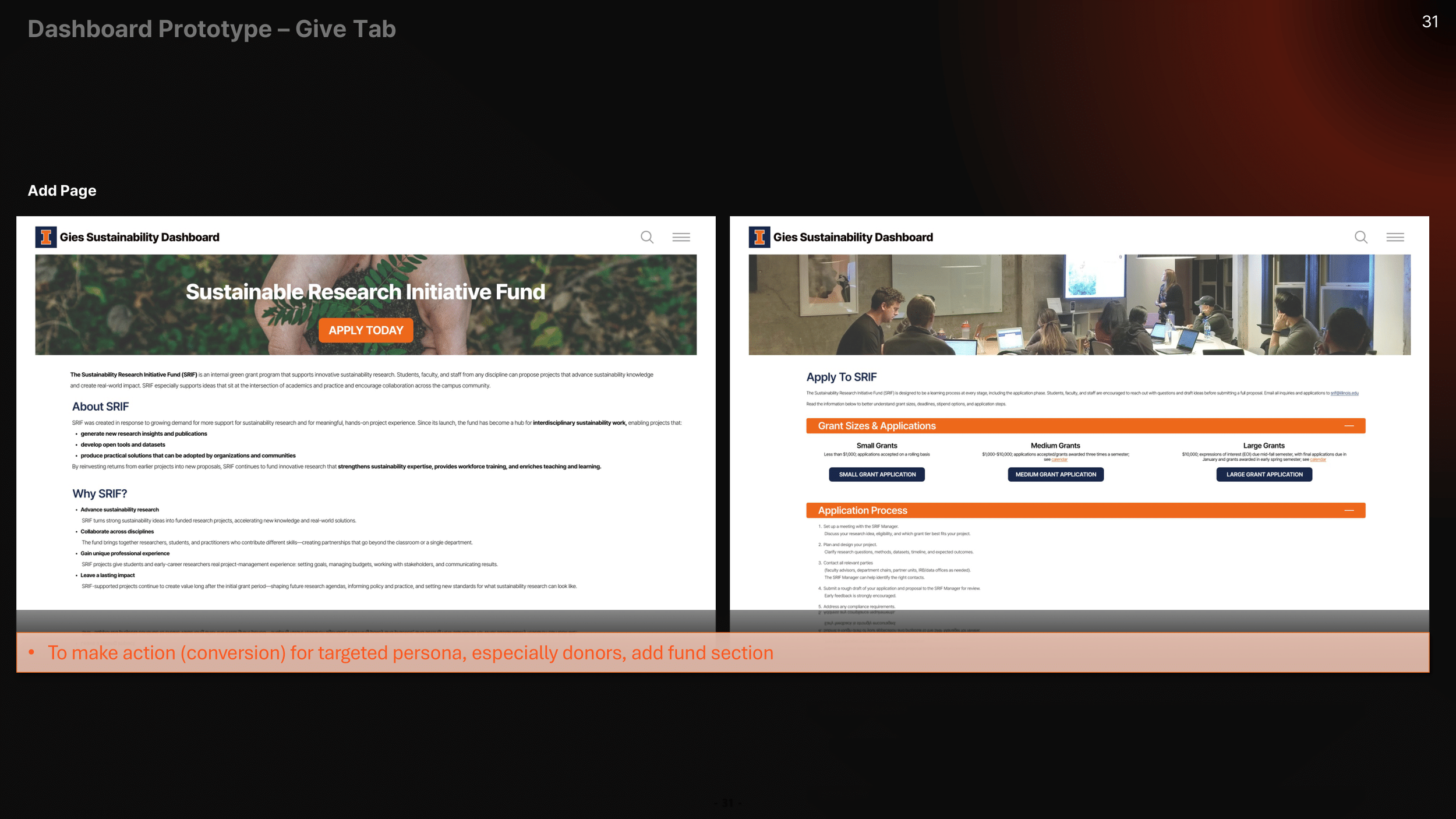
The University of Illinois developed a sustainability dashboard that maps faculty research to the UN’s 17 Sustainable Development Goals (SDGs).
Our team (Team NOVA) analyzed the current dashboard experience and proposed improvements focused on usability, clarity, and engagement.
Problem
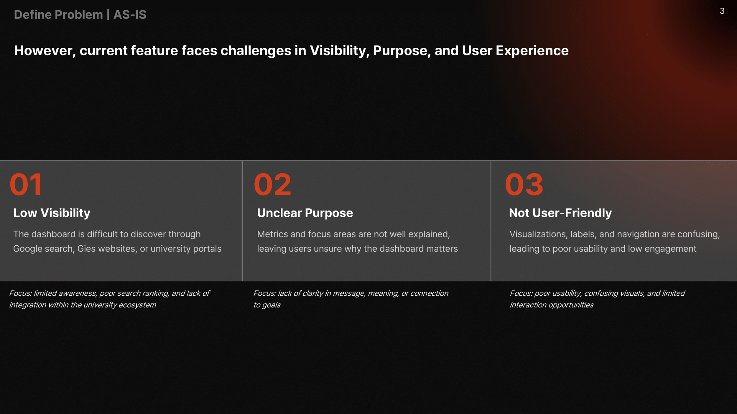
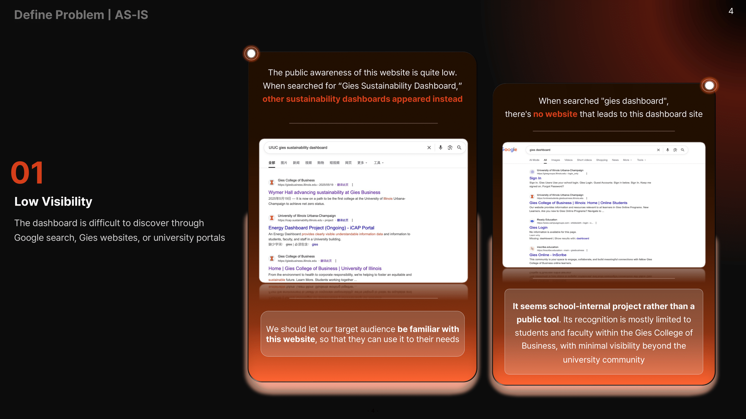
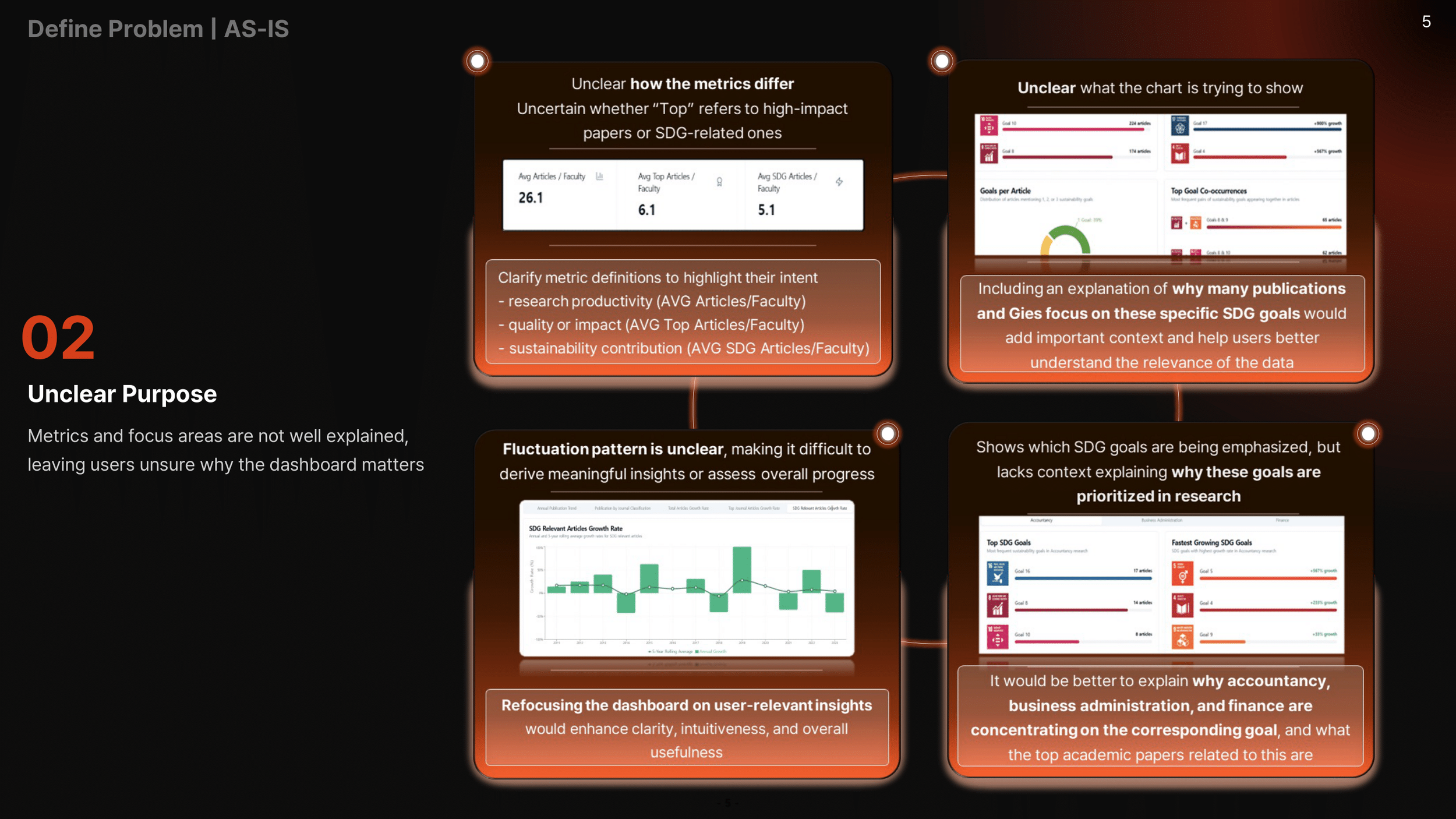
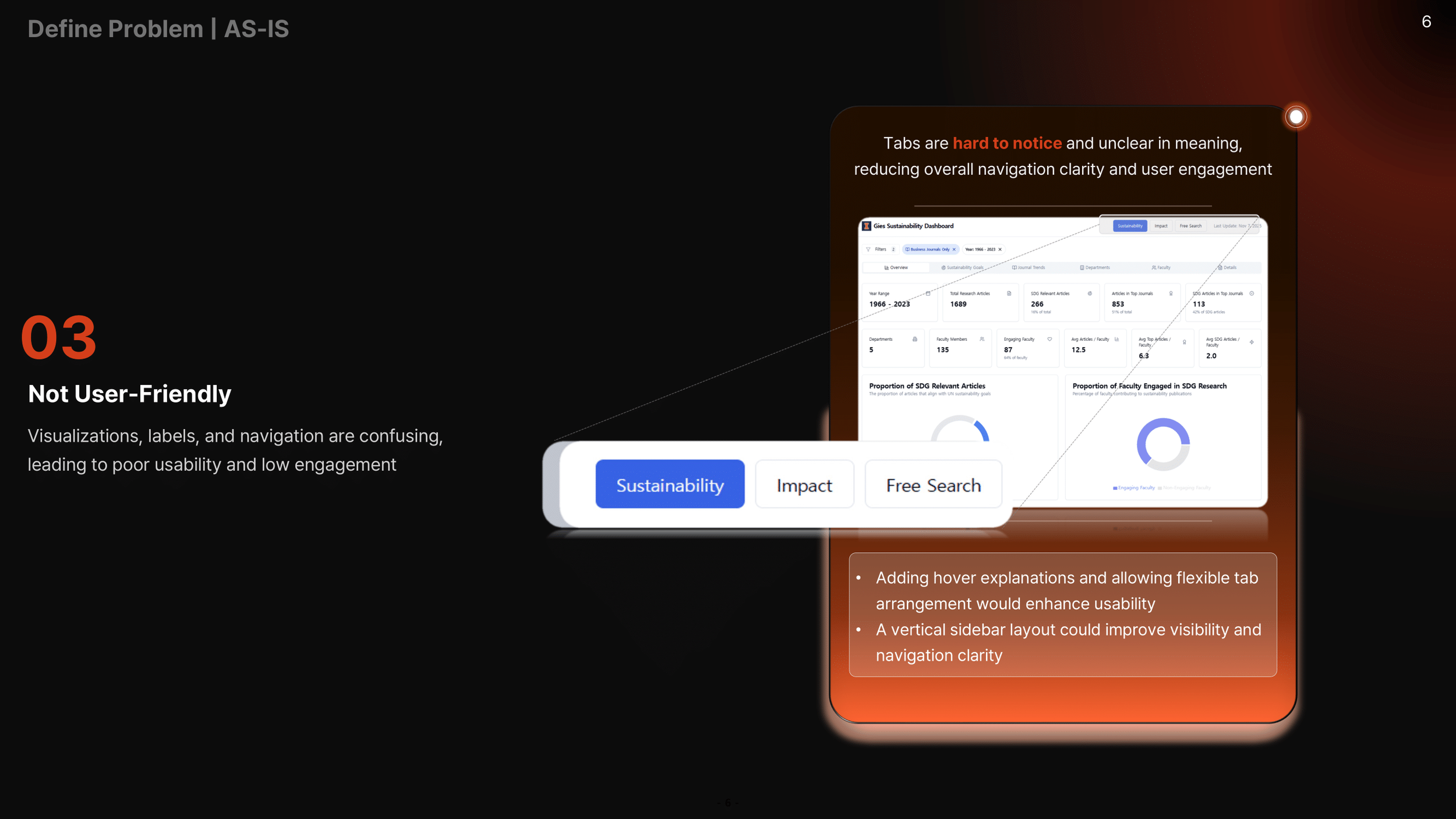
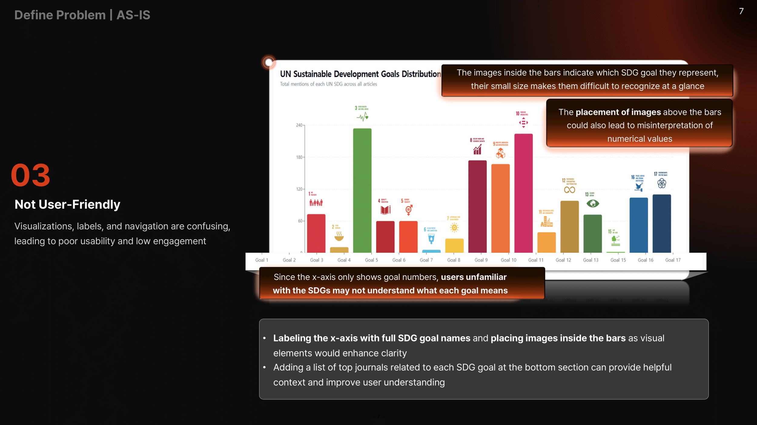
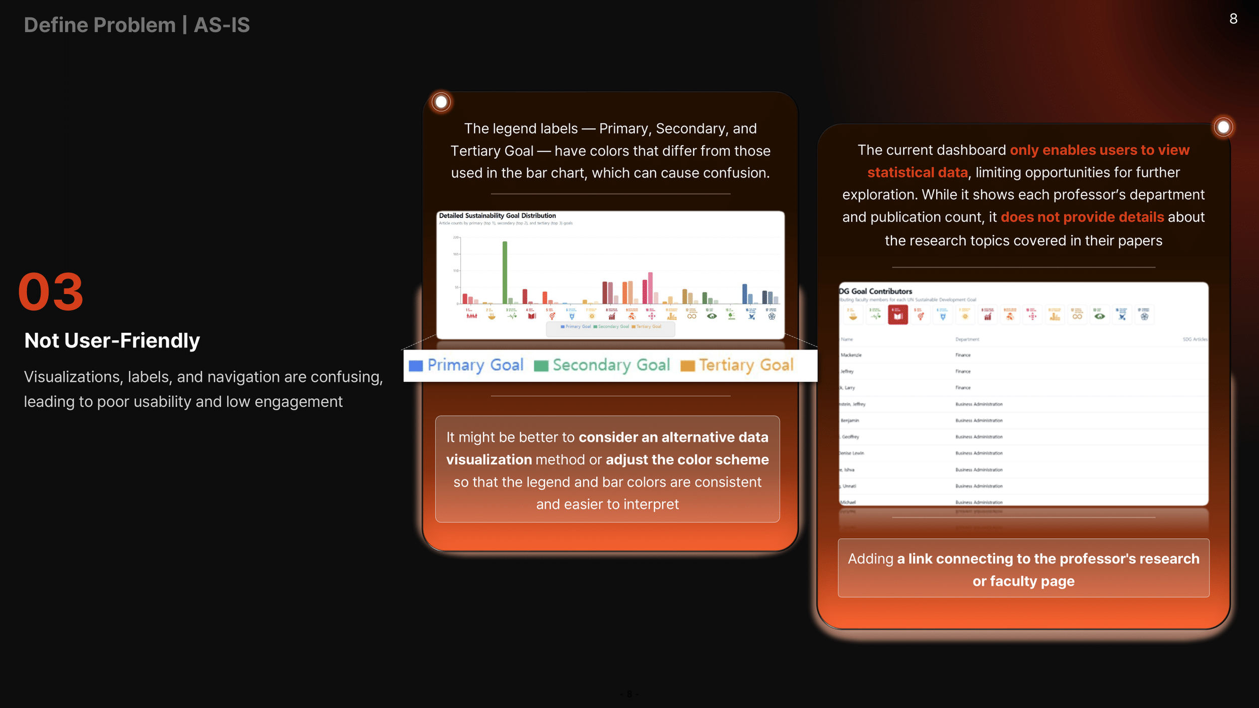
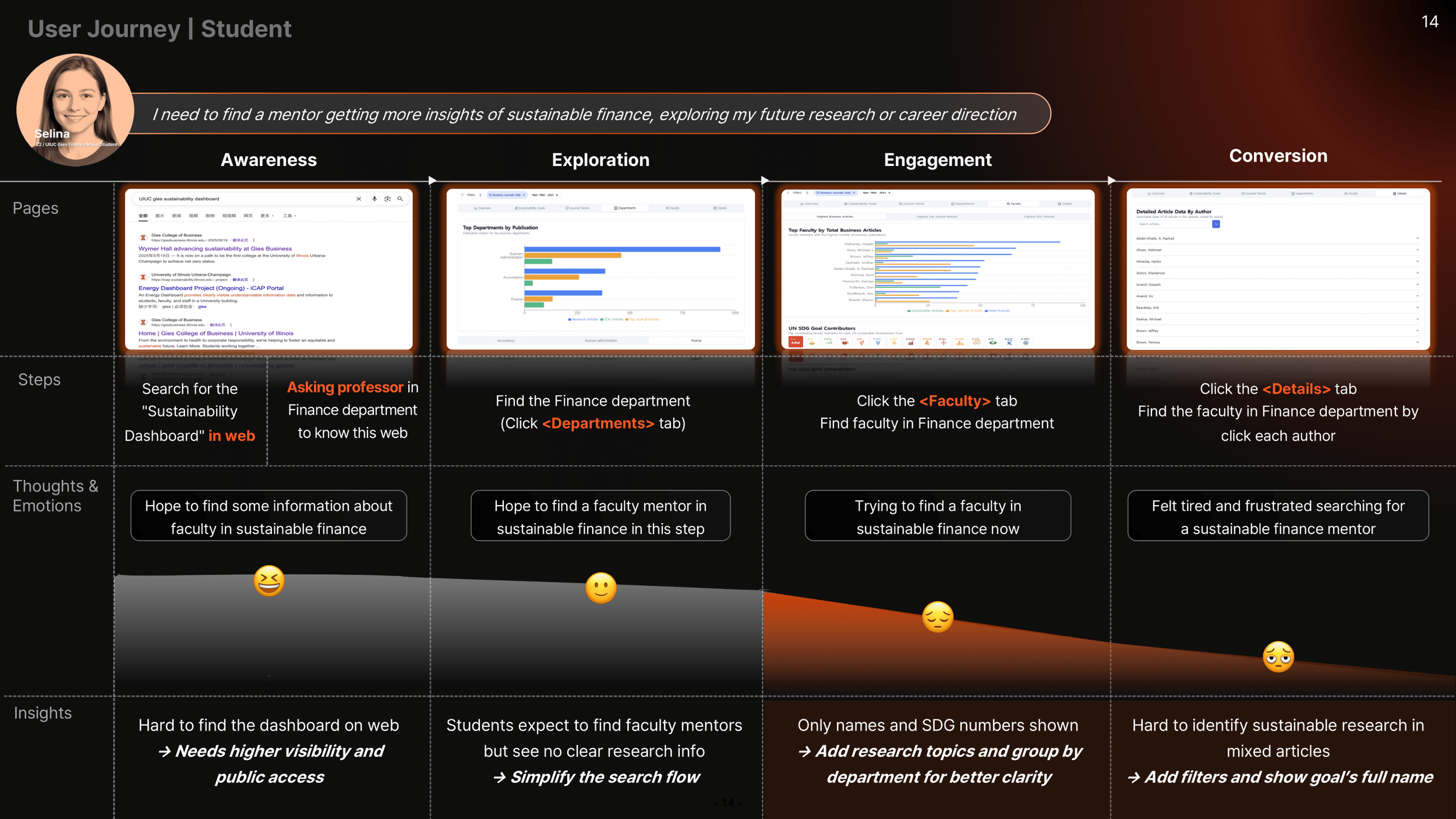
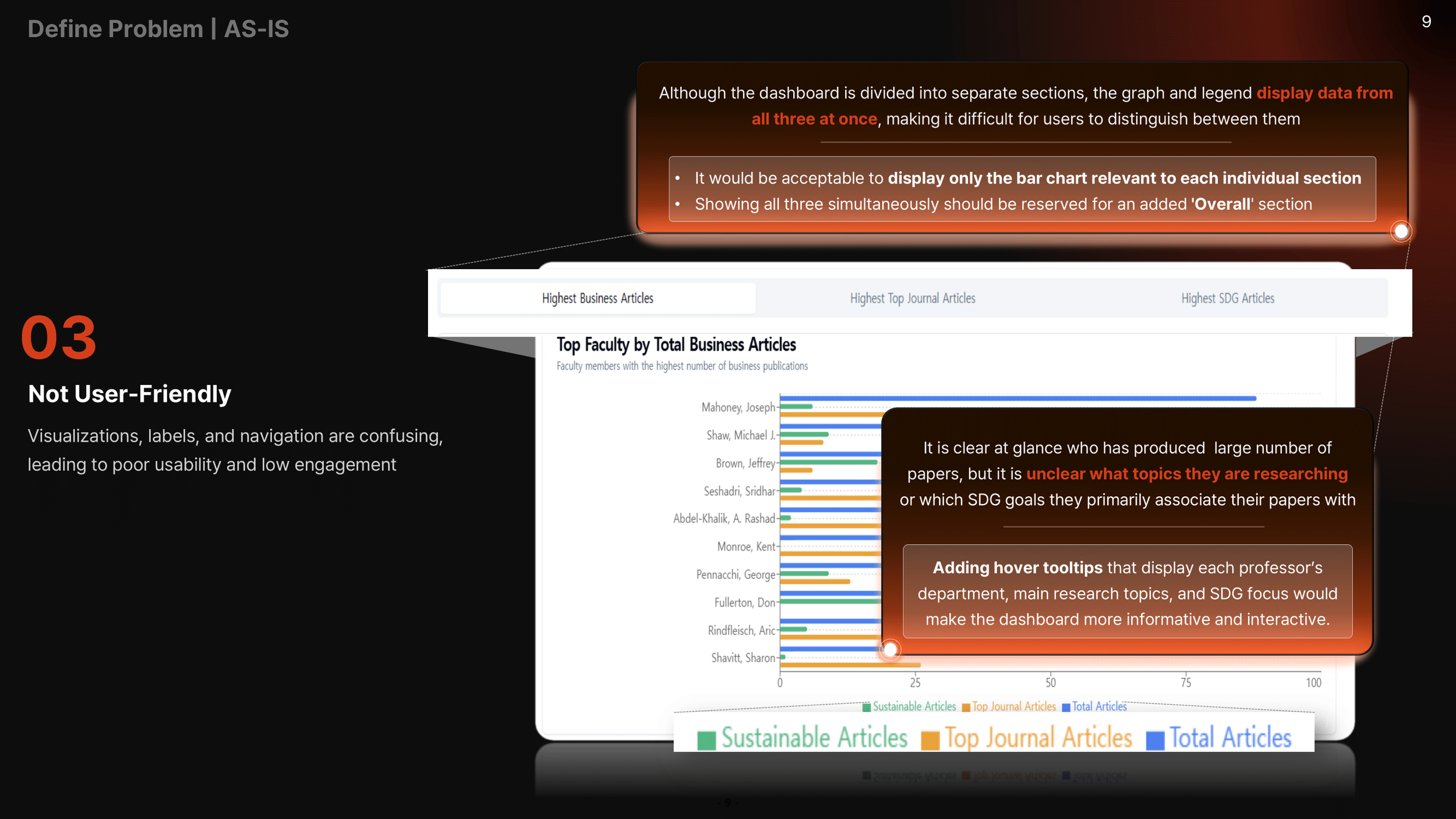
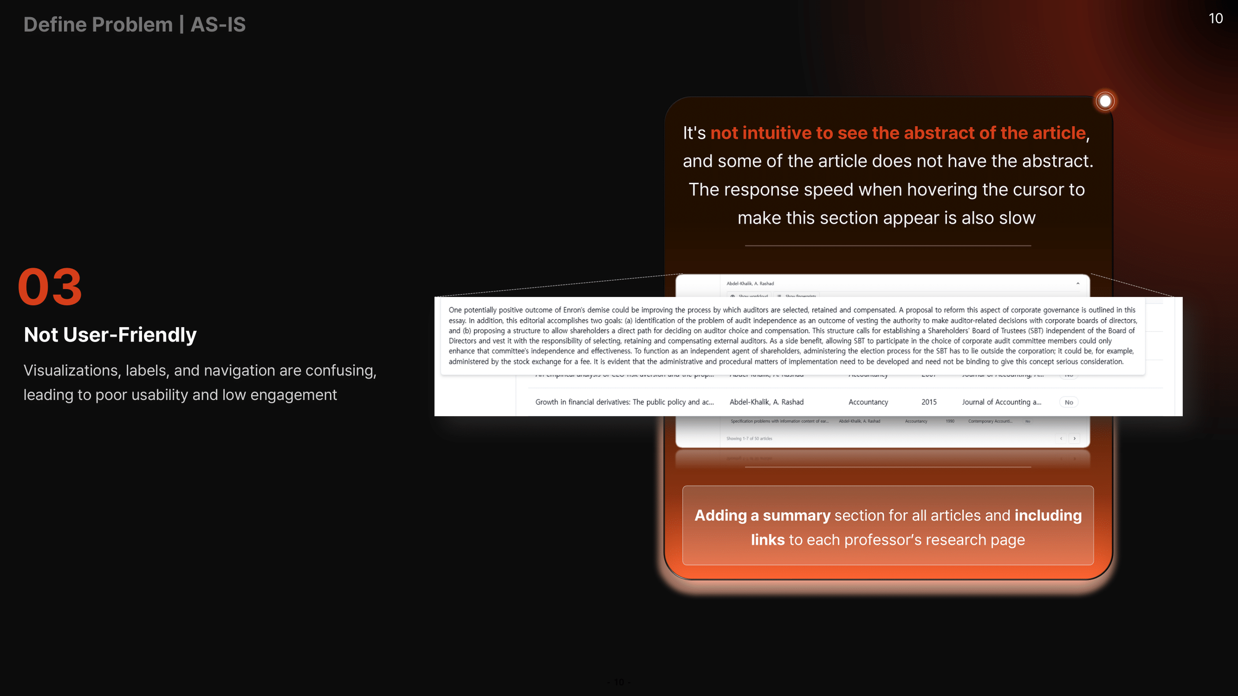
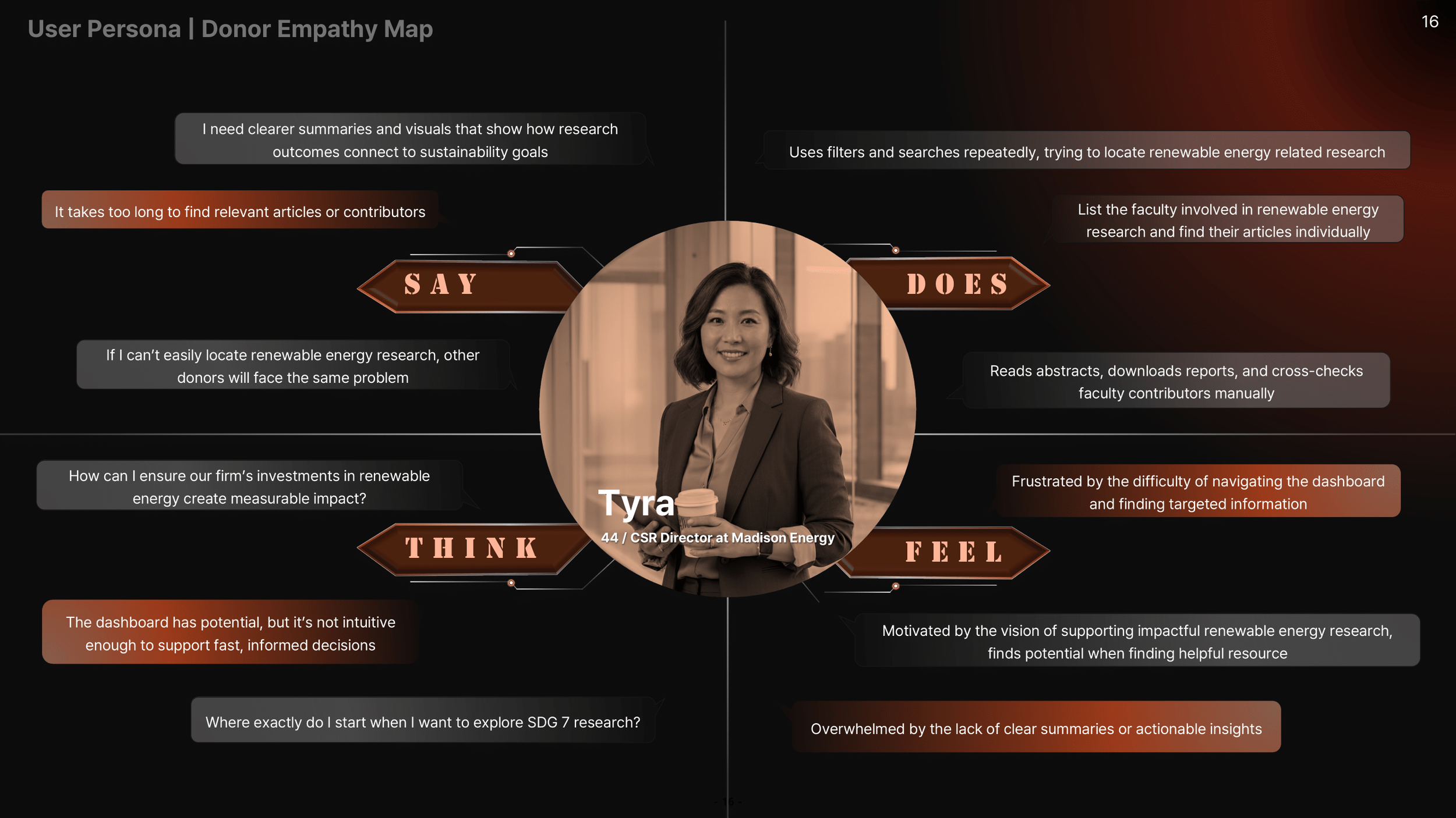
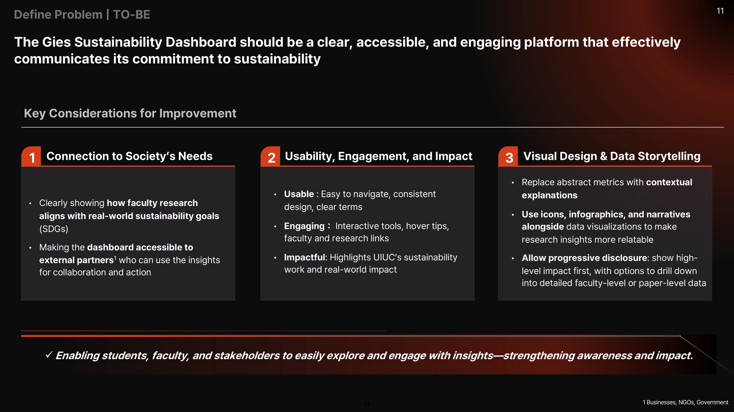
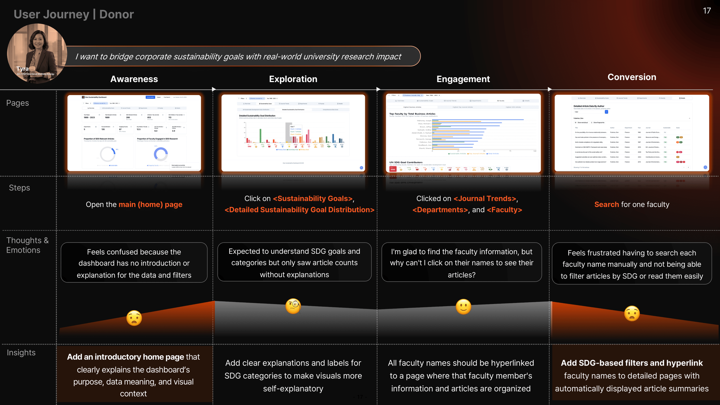
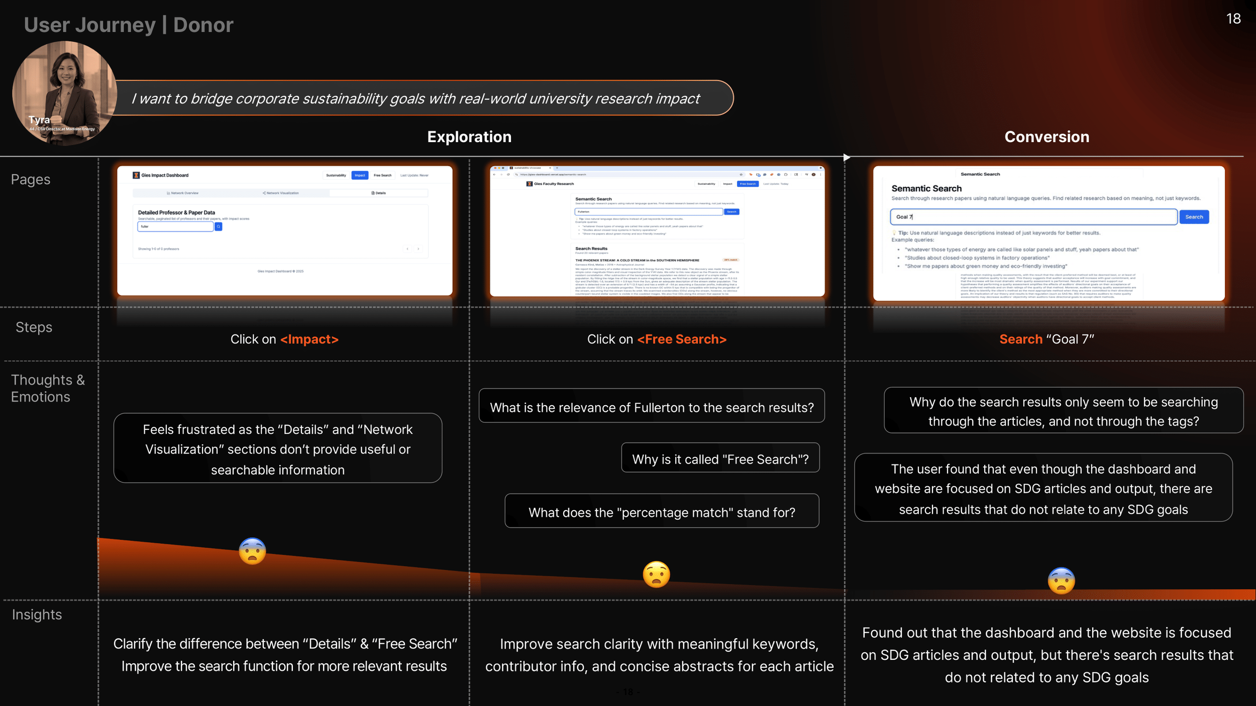
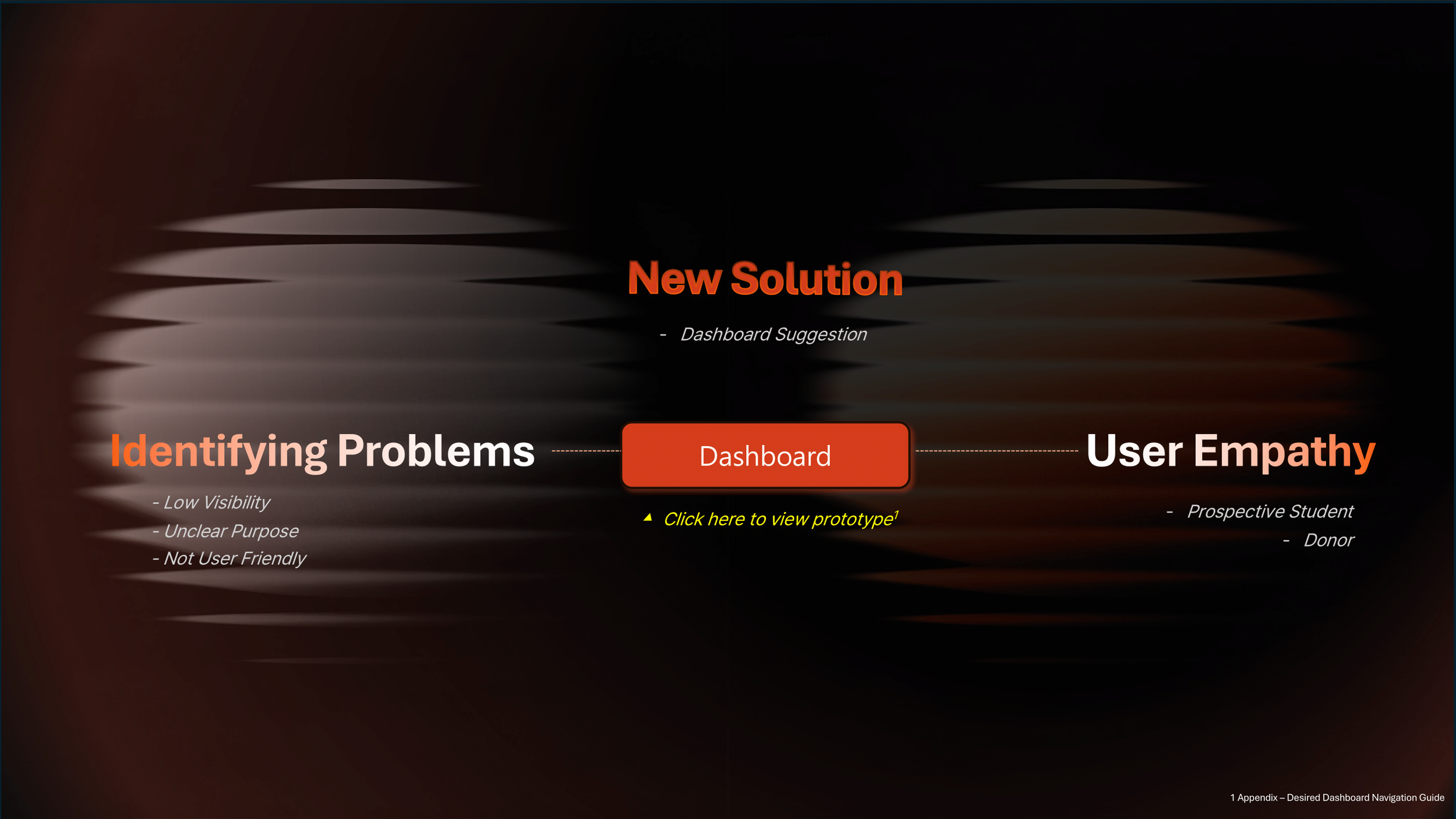
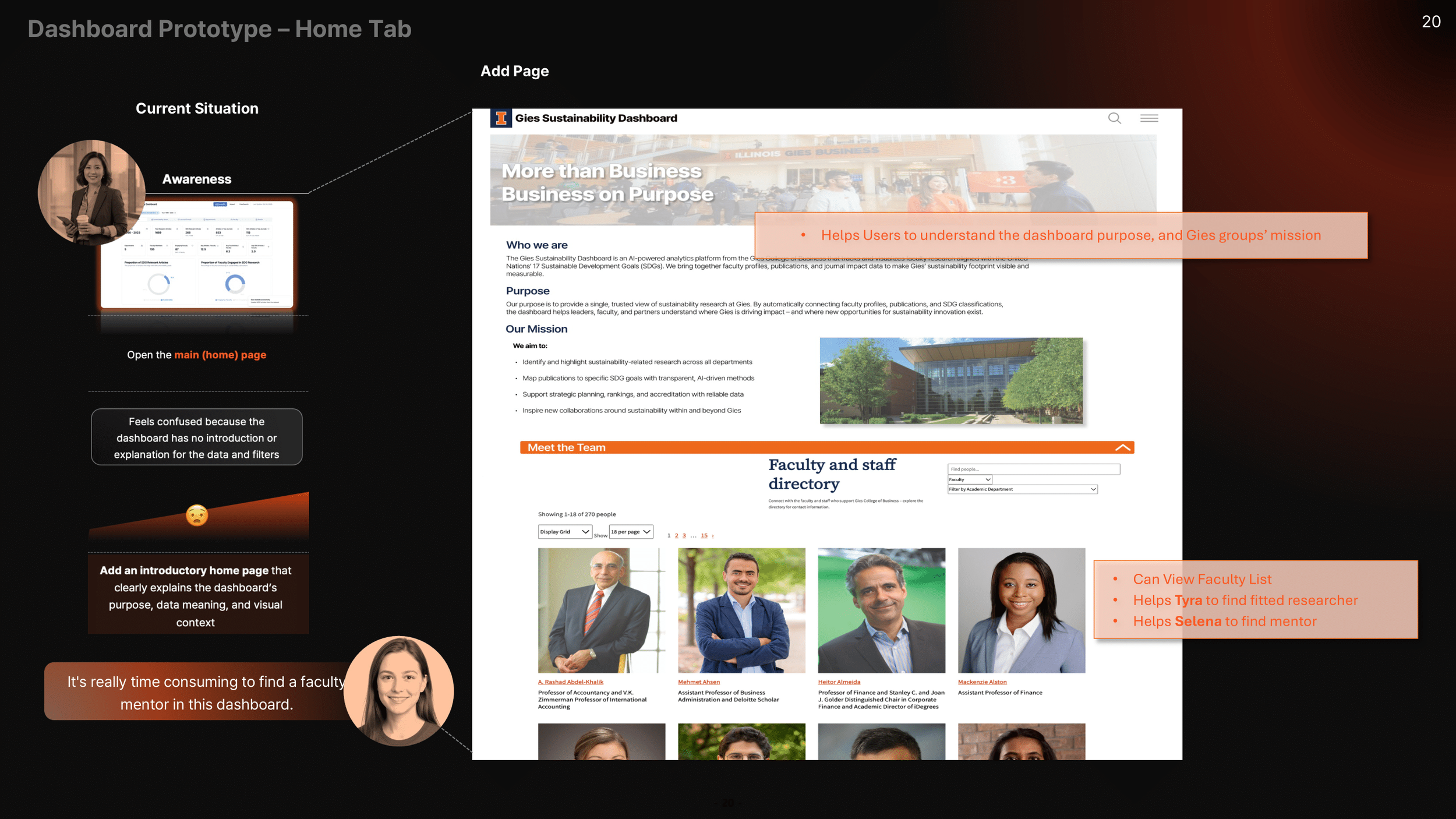
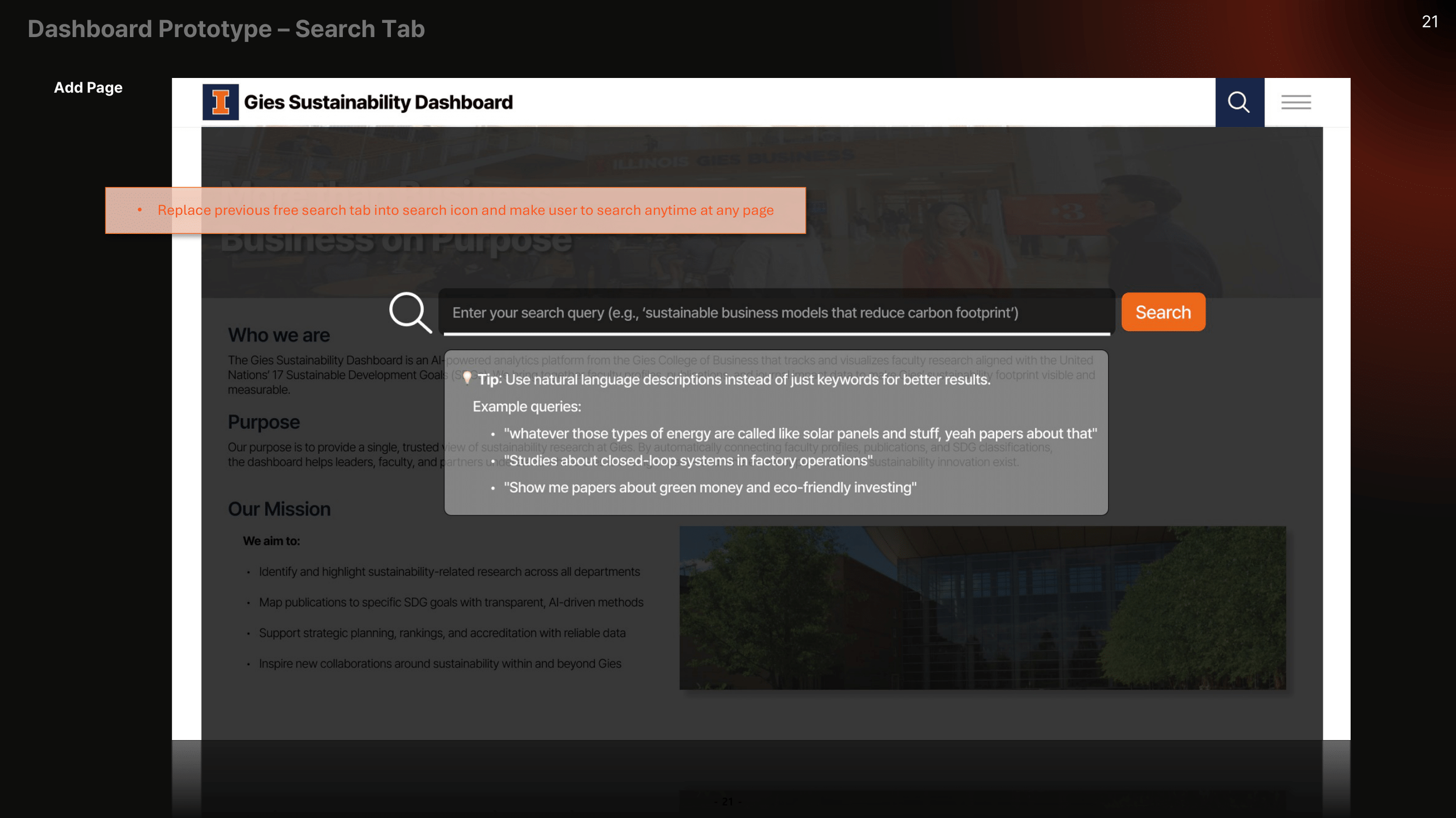
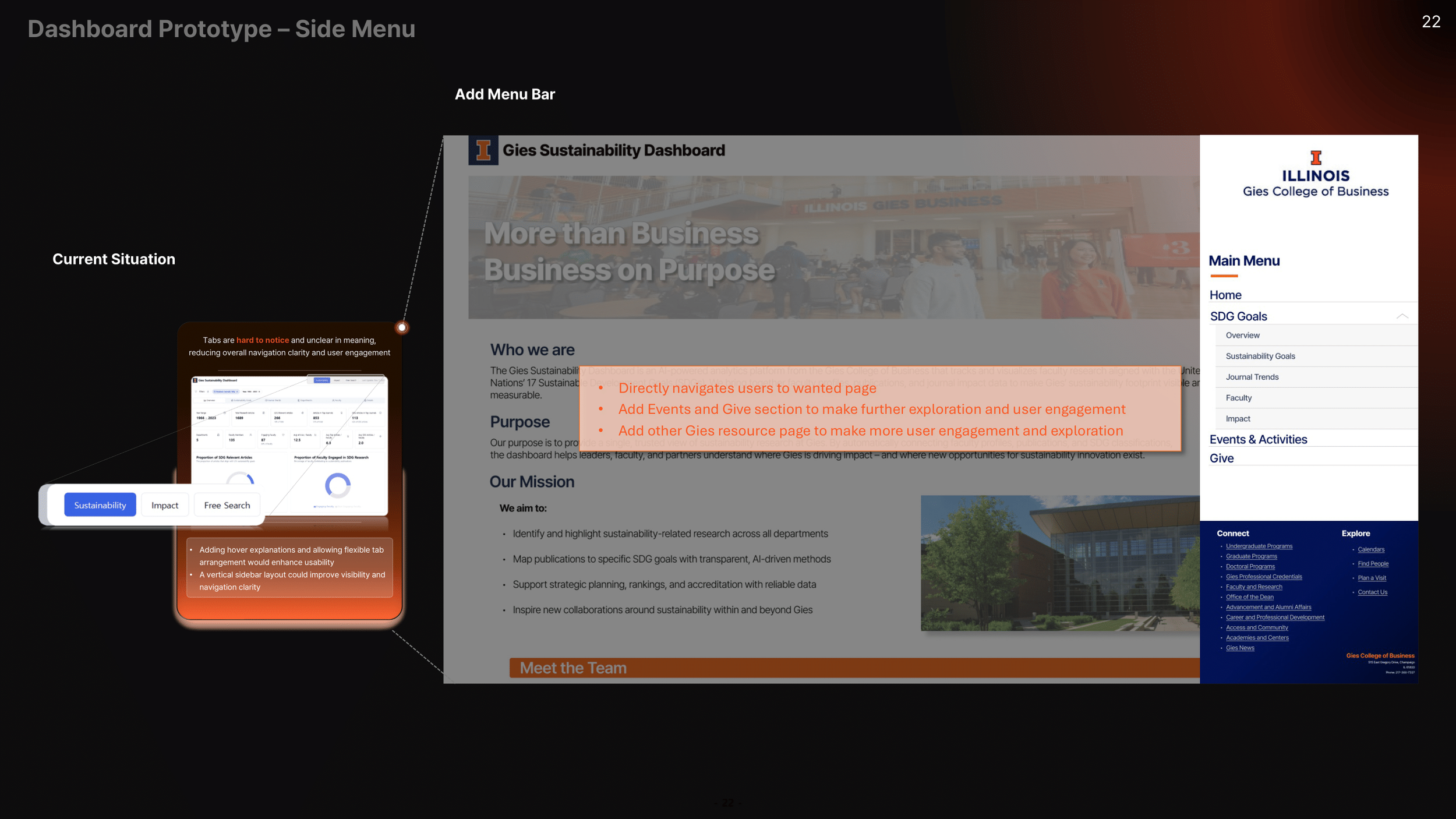
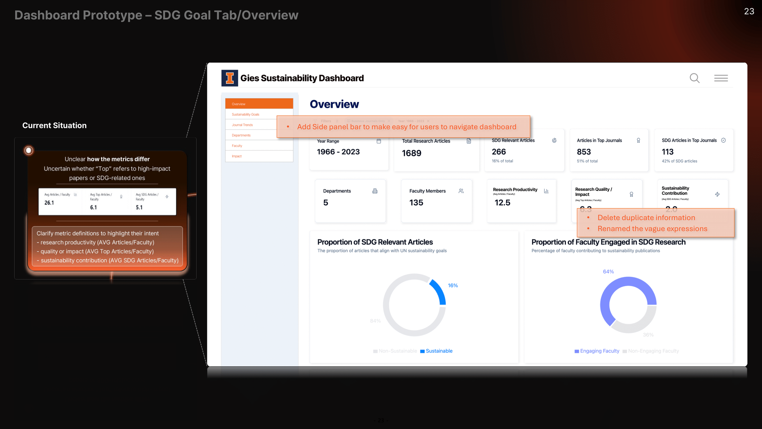
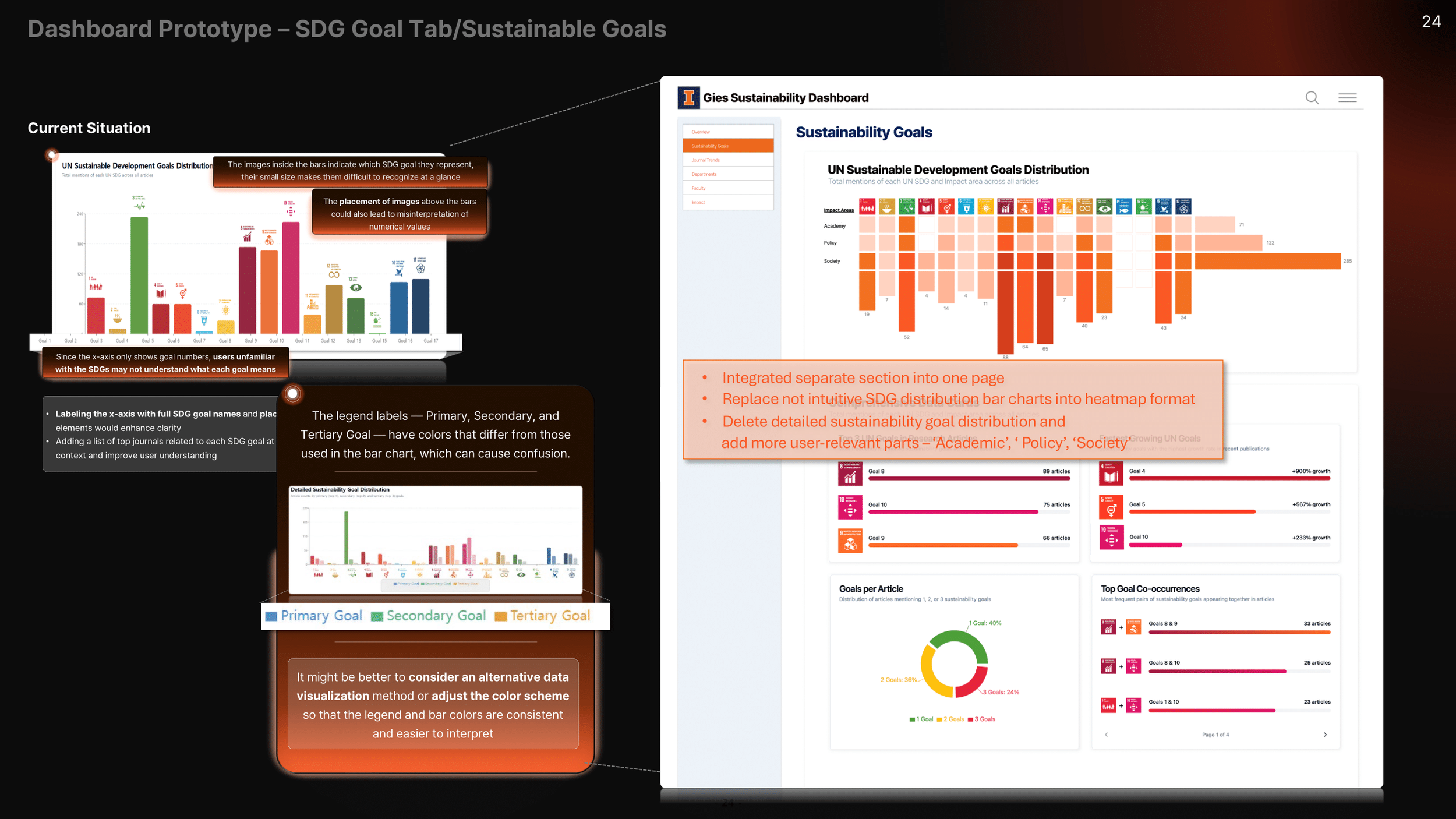
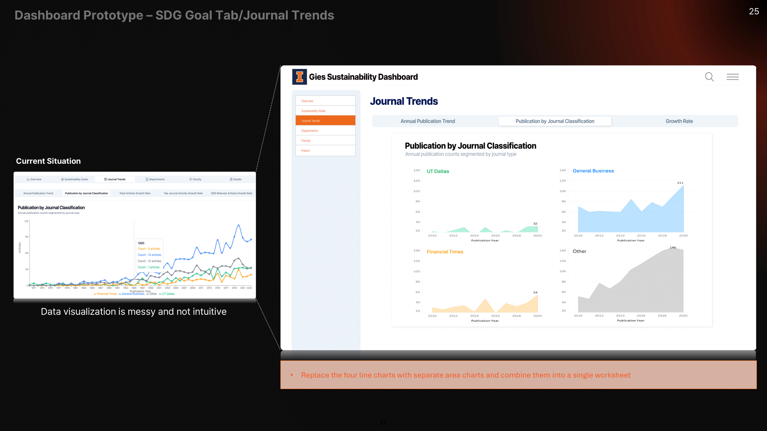
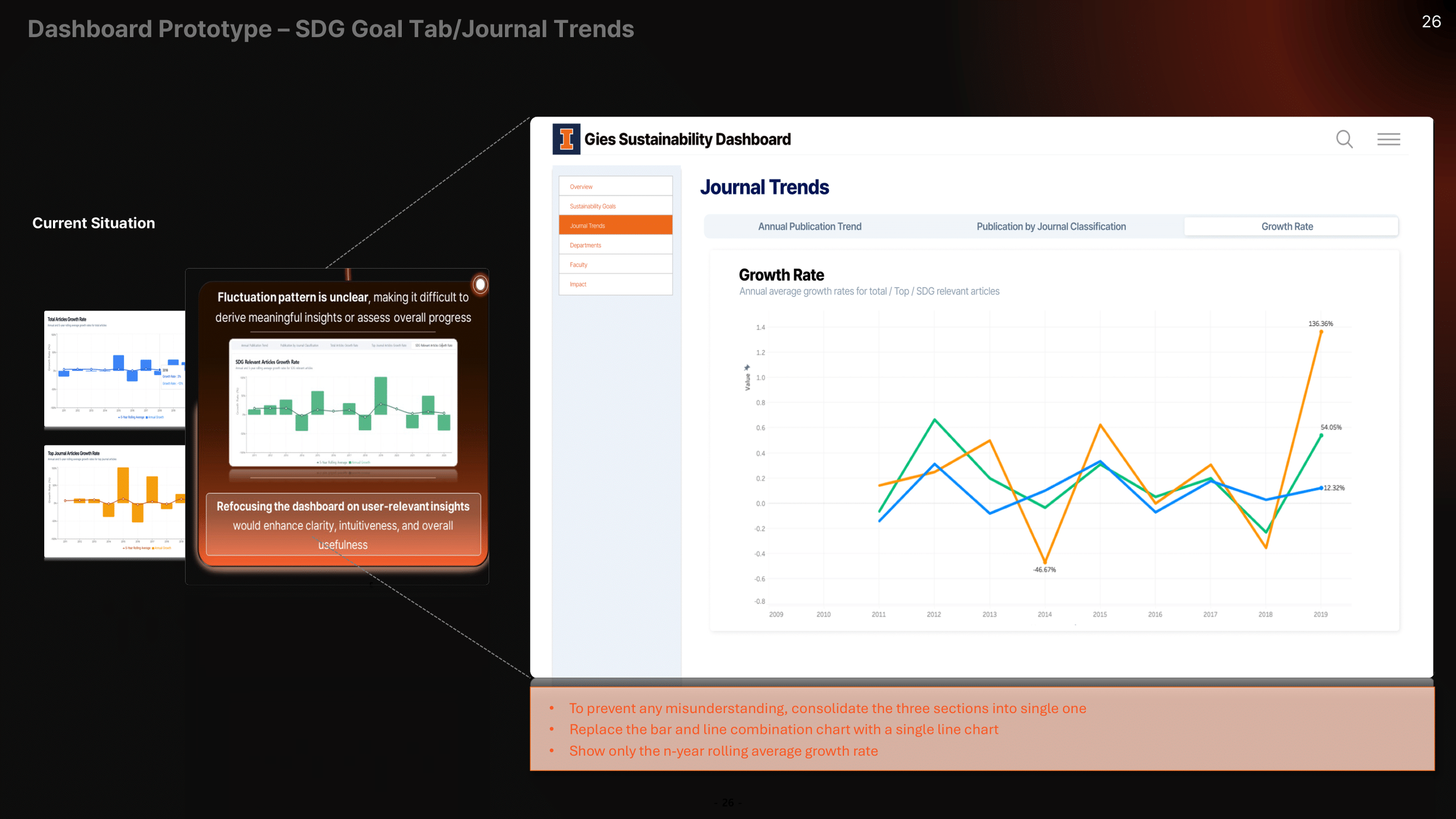
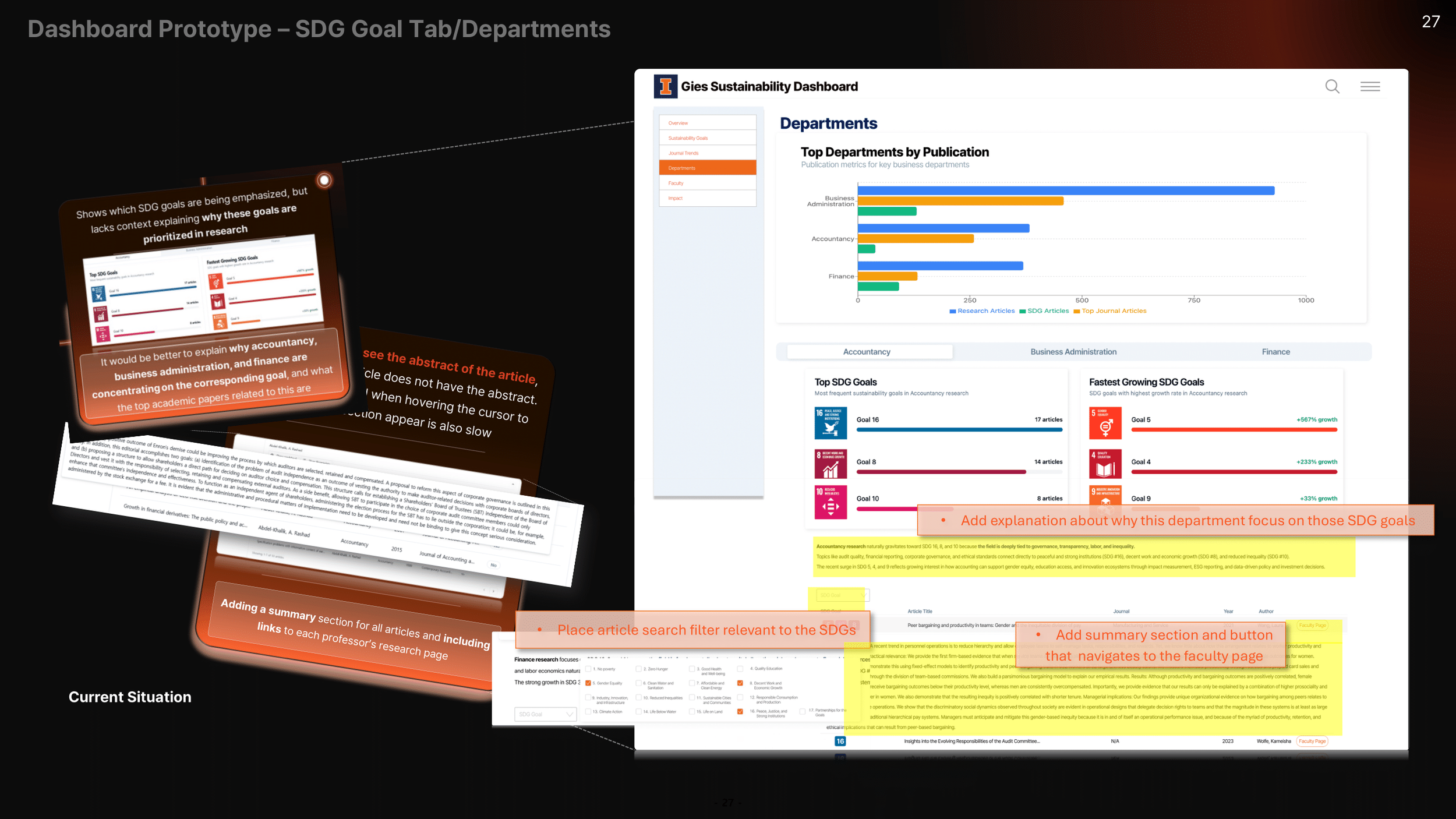
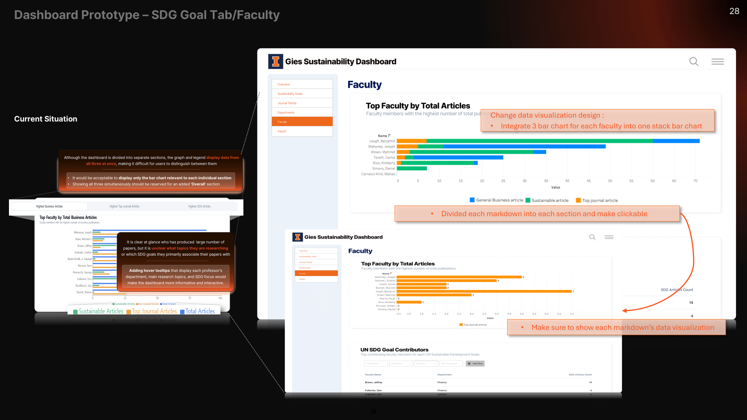
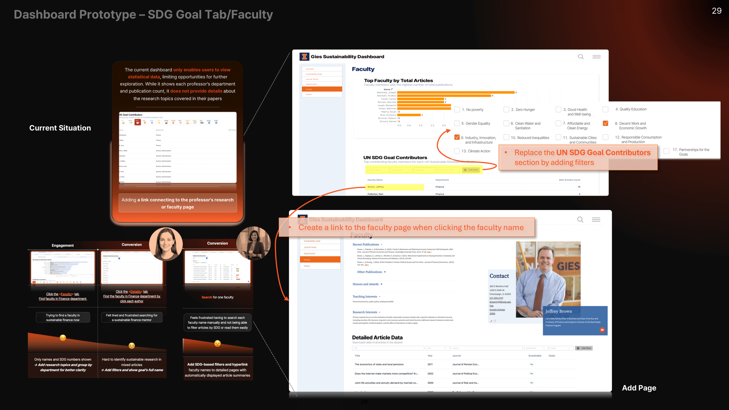
The existing dashboard experience had multiple UX barriers including low discoverability, unclear purpose, and confusing visual/navigation patterns.
My Role (Data + Visualization Lead)
I led the entire data-related workflow and was responsible for:
Designing and building data visualizations using Python
Translating insights into dashboard-ready visual concepts and UI improvements in Figma
Creating the team’s final presentation materials and storyline for delivery
Key Contributions
Diagnosed UX pain points in the current dashboard design (visibility, clarity, navigation)
Proposed UX improvements including clearer labeling, better SDG interpretation, and more intuitive navigation patterns
Designed user-focused storytelling improvements to make sustainability insights more accessible and actionable
Tools & Skills
Python, Figma, Data Analysis, Data Visualization, Dashboard UX Design, Data Storytelling,
Leadership, Communication, Problem Solving