Gies Sustabinability Dashboard Reformation
-
Redesign the UIUC Gies Sustainability Dashboard to improve discoverability, usability, and research transparency.
-
Led exploratory analysis of dashboard usability issues
Designed user research framework and personas
Developed UX wireframes in Figma
Proposed new dashboard information architecture
Created interactive filtering logic for SDG research exploration
Synthesized findings into final presentation for stakeholders
-
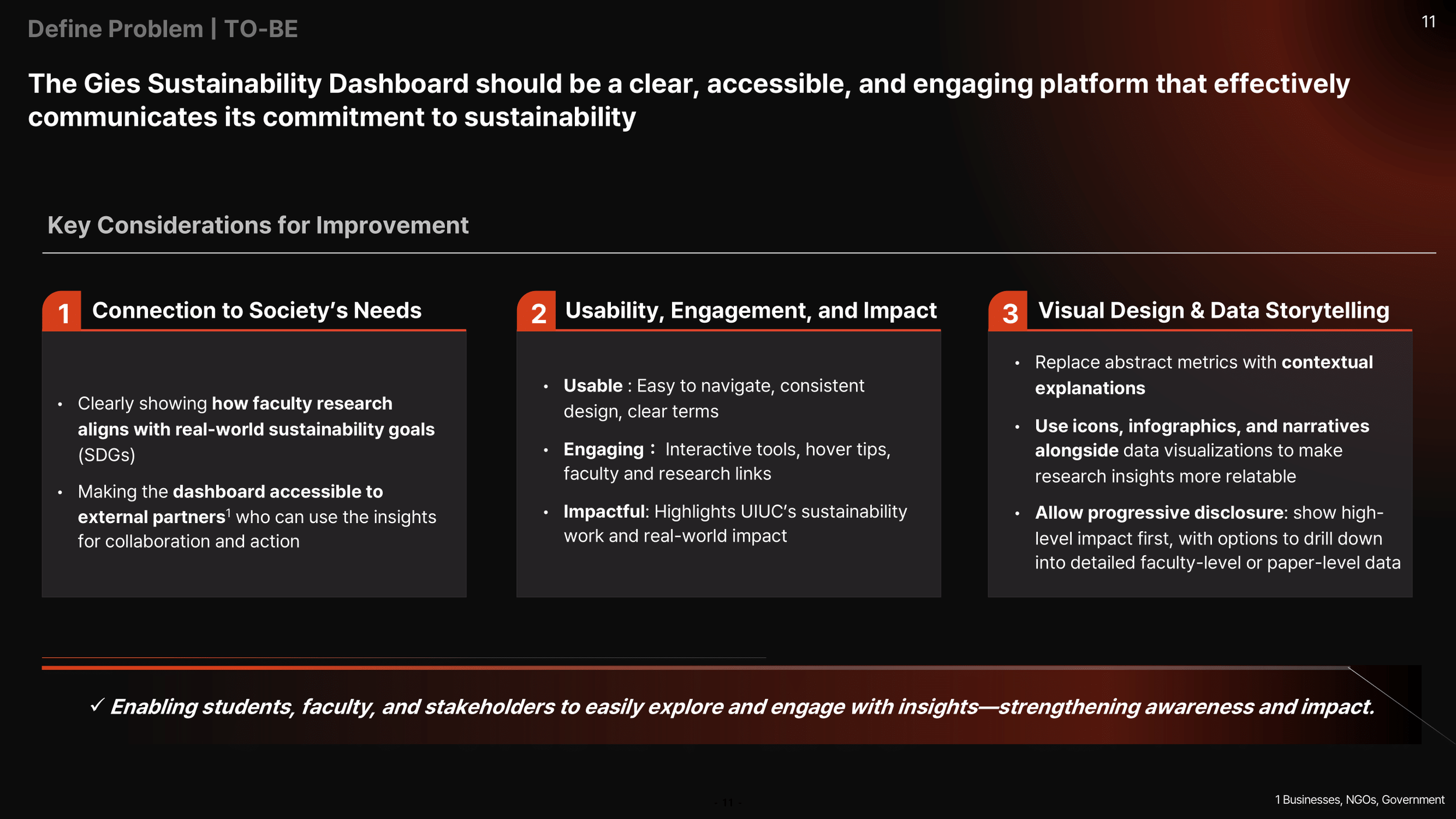
Proposed an interactive dashboard framework improving navigation clarity, SDG research discoverability, and stakeholder usability.
Final Creation Expected Impact
The redesigned dashboard improves:
Research discoverability through structured SDG filtering
Navigation clarity via simplified information architecture
Stakeholder engagement through interactive visual storytelling
This framework allows students, faculty, and external partners to explore sustainability research more efficiently.
Overview - Context & Challenge
The competition challenged teams to improve the Gies Sustainability Dashboard by addressing three pillars:
• Scalable Data Strategy
• Insight Generation
• Dashboard Visualization
The goal was to transform the dashboard from a static descriptive tool into an accessible, engaging, and stakeholder-centered sustainability intelligence platform.
The Problem (AS-IS Analysis) - Key Issues
-
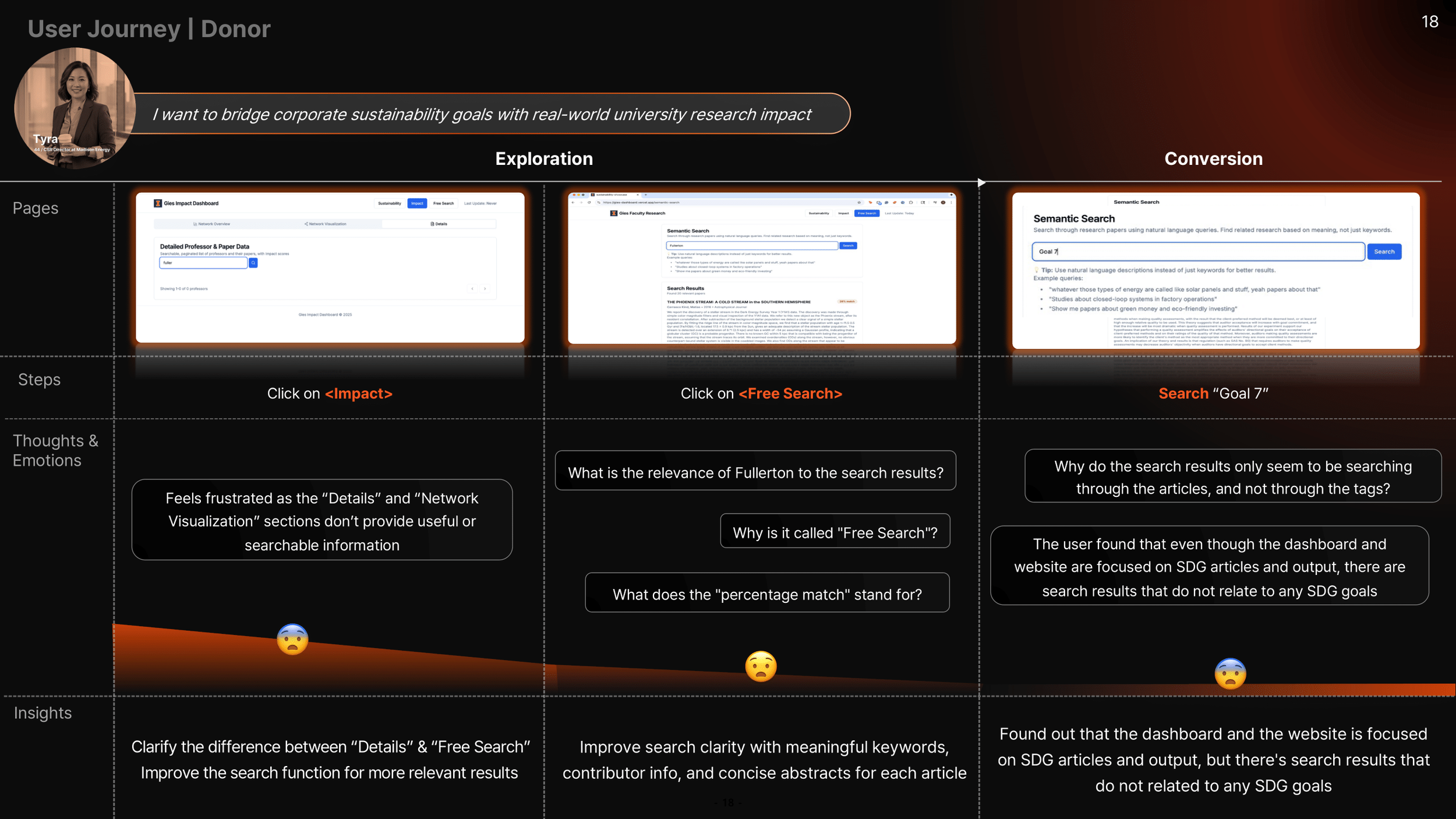
• Not discoverable via Google
• Poor integration into the university ecosystem -
• Metrics lacked explanation
• SDG classifications lacked contextual meaning -
• Confusing navigation
• Inconsistent legend colors
• Limited drill-down capability
• Slow hover response
• No faculty-topic transparency
User Research & Persona Development
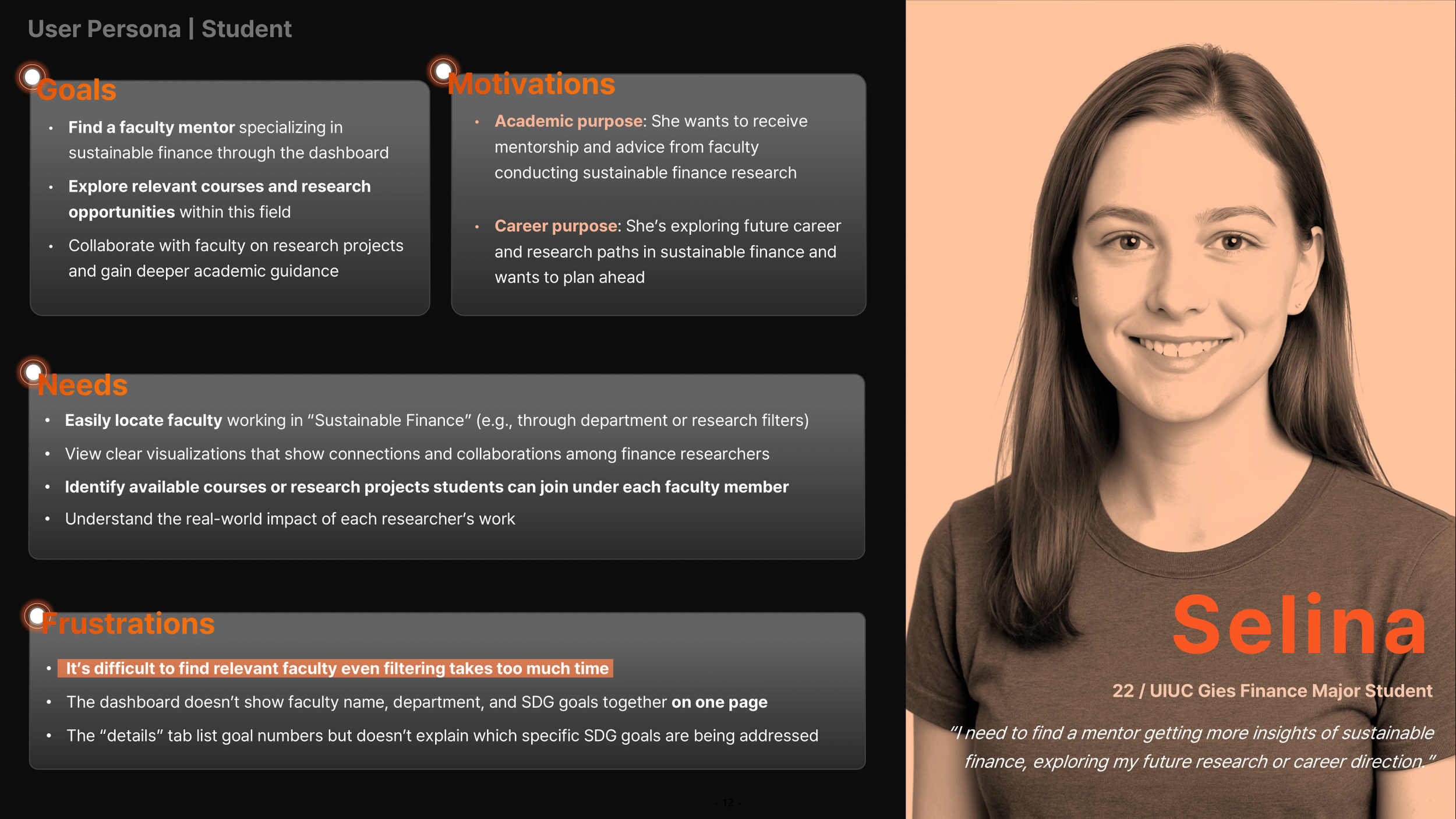
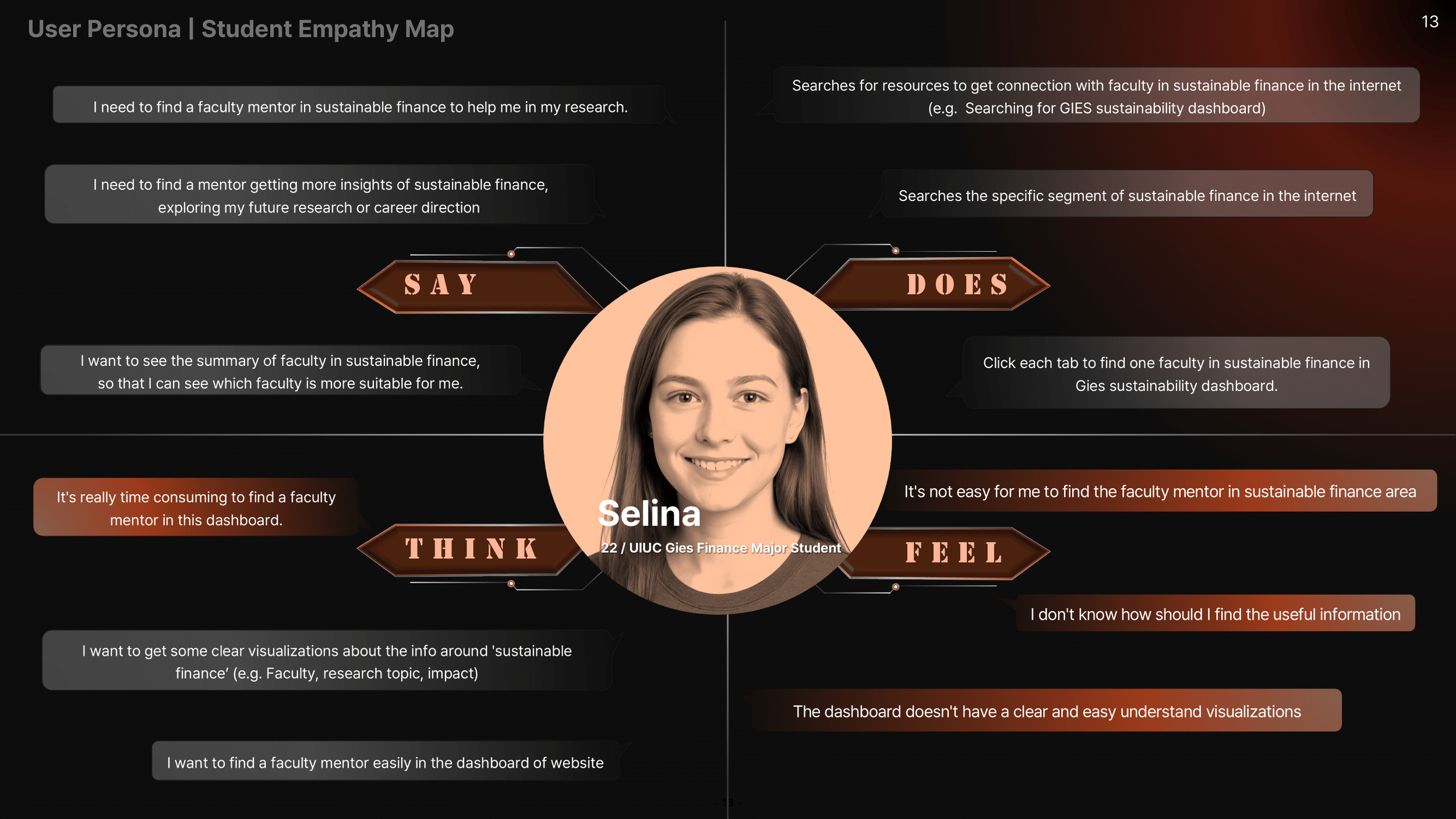
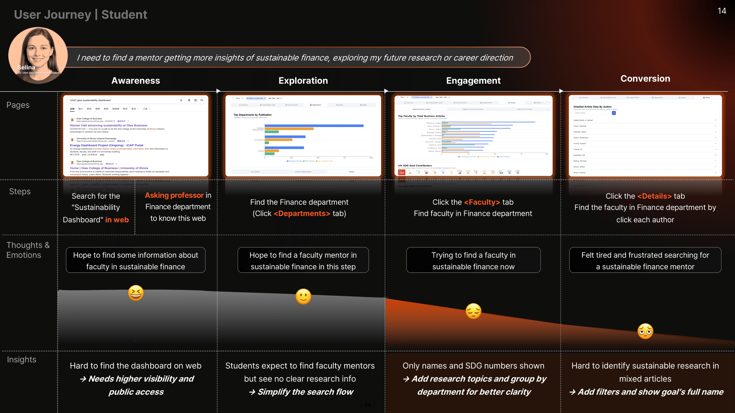
Persona 1: Student (Selina)
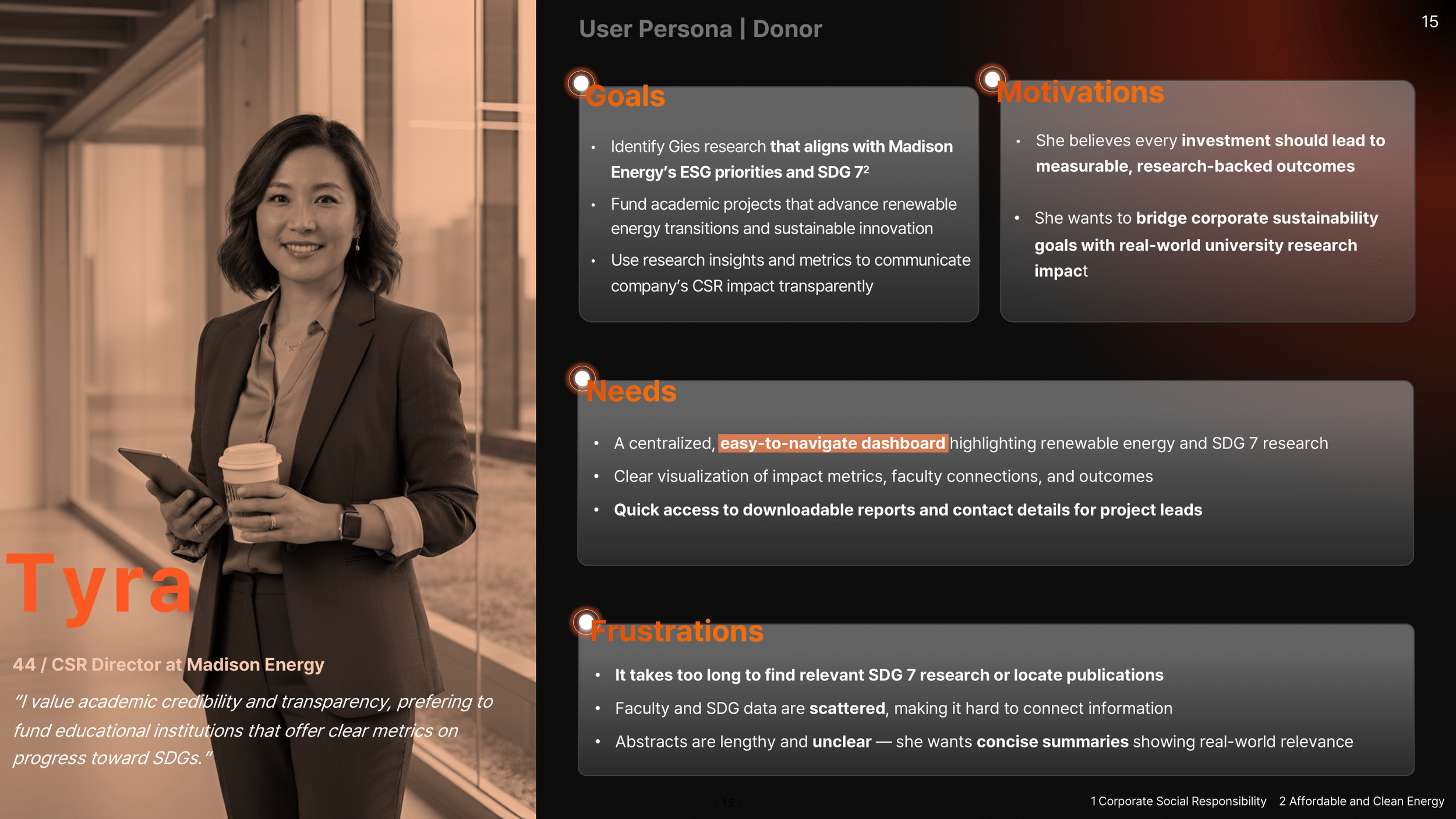
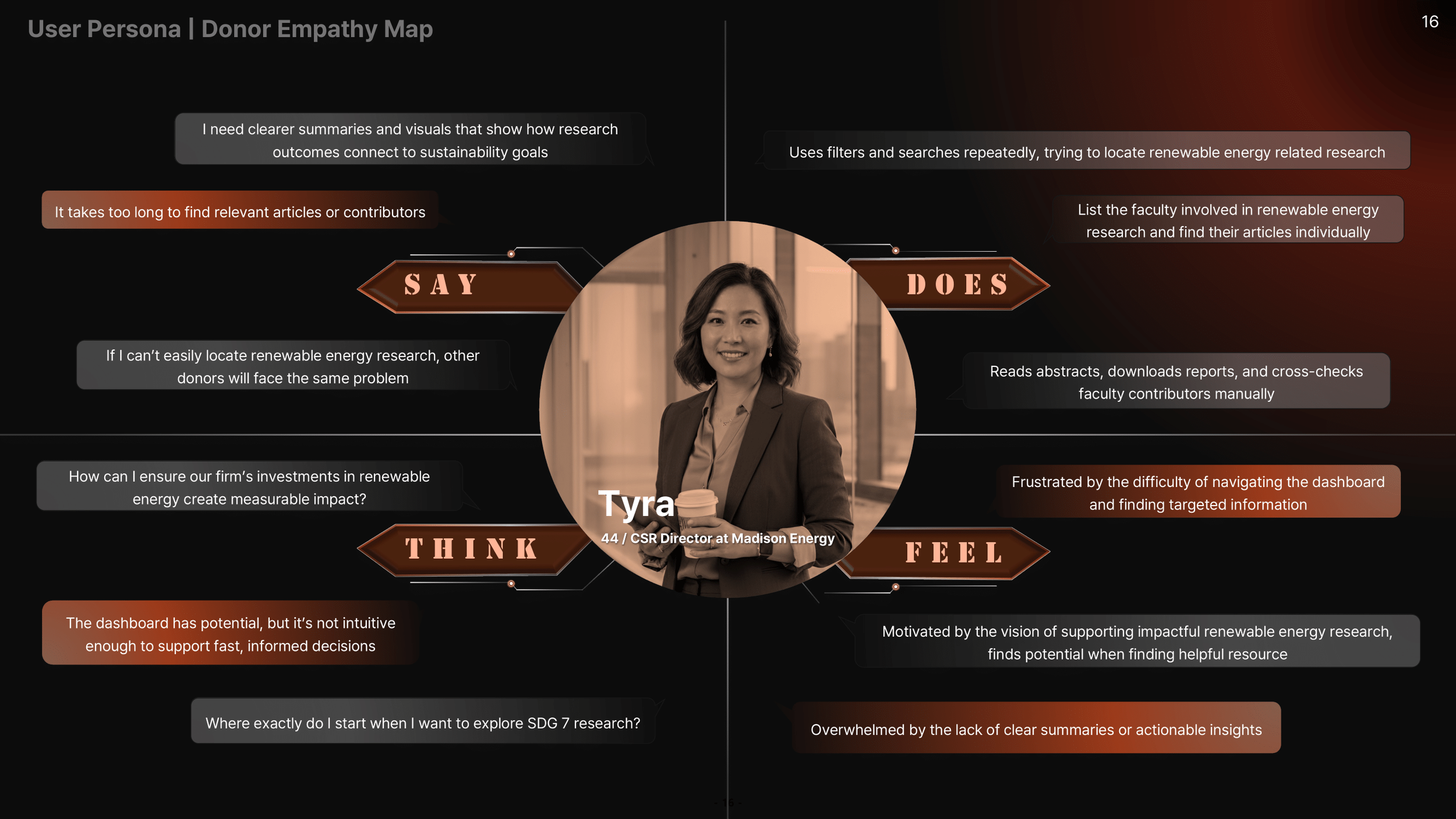
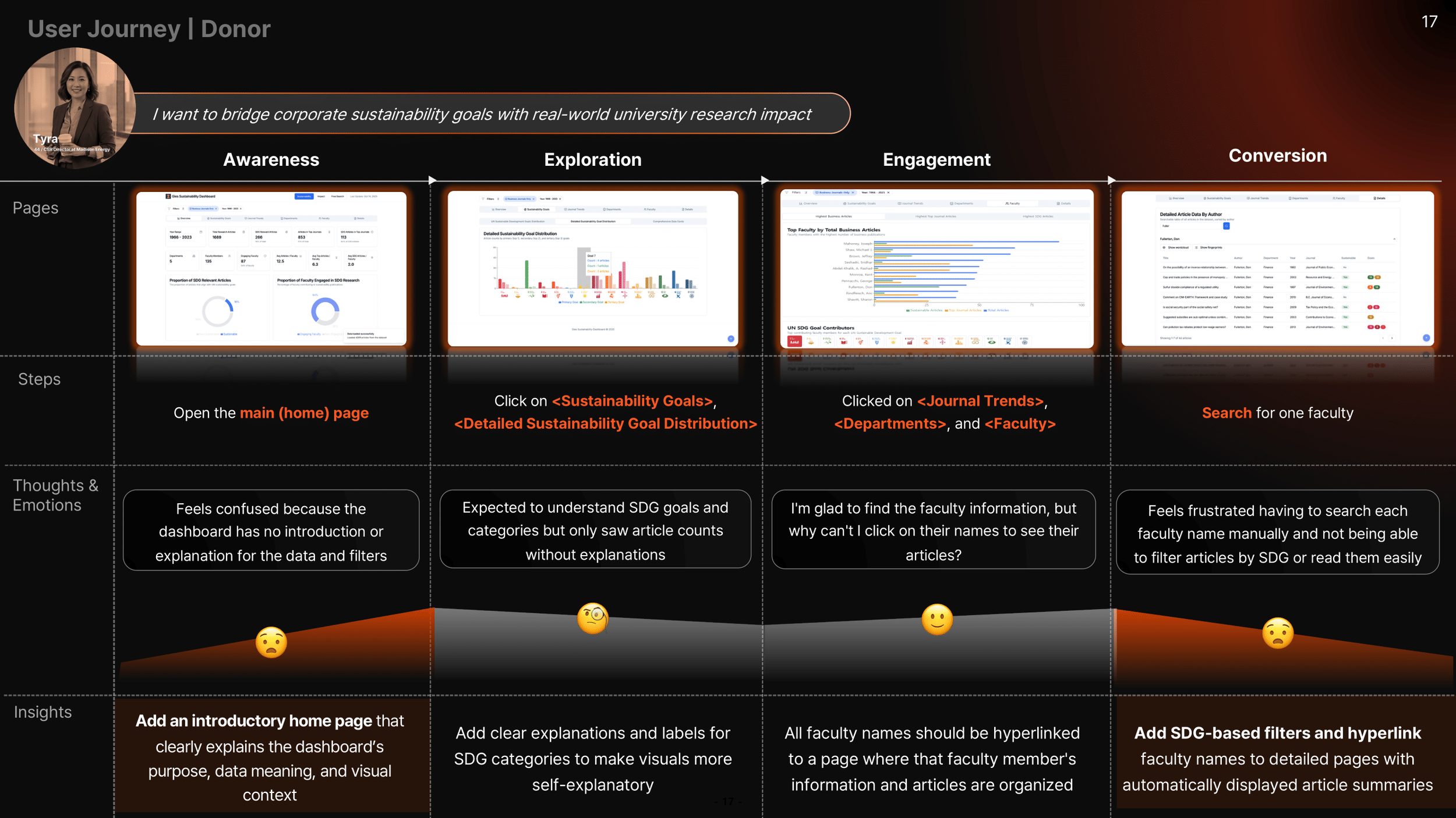
Persona 2: Donor (Tyra)
Strategic UX Framework (TO-BE Vision)
my role: product designer + data strategist